

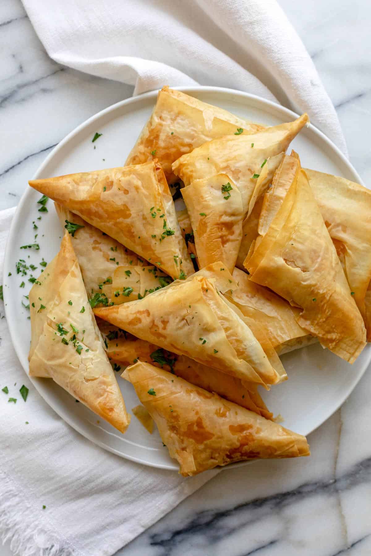
These homemade Greek spanakopita triangles are a delicious appetizer bursting with flavor that can be likened to Middle Eastern spinach pies. Phyllo (filo) pastry is filled with seasoned spinach and feta cheese for a delicious vegetarian snack. You’ll be sure to impress your guests with these! Should be served warm. Prepared triangles can be kept frozen and baked later.


This site has a simple, easy to understannd design with clear sections. It gets straight to the recipe and doesn't meander like others do. I like how the description, yeild, and time estimates are displayed, and the easy to use "print" button seems like a useful feature. Unfortunatly it contains pretty much no pictures, which is kind of a problem for this recipe since folding the triangles is difficult to understand without a visual guide.
While the layout of this page leaves a little to be desired compared to the previous one, it makes up for its sprawling inefficency by being much more in depth and containing tons of pictures. This site contains an automatic doubling and tripling button for the ingredient amounts, which could come in handy. Perhaps one where you can input any number would be fun. This recipe conatins much more detail about what spanakopita is, including what course it is served in. It also lists nutrition facts, alternative fillings/flavors to try, and helpful tips about cooking and storing the food.
Finally, this site is probably the worst of the three. While it contains many of the useful features of the others, like an ingredient multiplier and nutrition facts, the quality of the instructions is severely lacking. There are no progress pictures and the recipe consists of only four steps, compared to the others' 8-10. I would probably struggle to use this recipe as it does not describe what I need to do in enough detail. Two redeeming qualities that the other sites lack is a switch that can be clicked to stop the screen from falling asleep while you are cooking and looking at the recipe and a much more robust review and social aspect. There are many user-submitted photos of their finished spanakopita and lots of reviews. This might help users more accurately gadge the realistic output of this recipe.
This site has a fun and lively vibe, using irregular shapes, rounded edges, and a bright but controlled color pallete. The scrolling text bar you see as you scroll down makes the site feel active, and the way icons change and move when you hover your cursor over them is engaging. The shape and motion of the flavor carosel evokes taking a snack box from a store shelf, which is a cool tactile touch for a cracker/cookie company's site.
While the bare asethetics of this site seem irrelevant to this project, there are several basic things I really enjoy. First, the loading icon being a colored shape that mimicks the five gemstones on the site is really cool. If I ever need to implement a loading screen I will take inspiration. Again, I also like how tactile the site feels, reacting as you move your cursor around the screen and near different objects. It immeditely feels like a more luxury and engaging experience. The same effect of changing the screen with cursor movement continues through the whole part of the site, which helps it feel less gimmicky.
This is an attempt at a tactile website experience that falls short where the other two don't. While the opening is cool, making you wipe away a pink mask with your cursor to see the home page, it goes downhill from there. The prior two sites were very careful in subtly indicating to the user which elements are interactive/clickable and which are not. This site fails to intuitively diffrentatie between the two through design, leading to a more frustrating and confusing experience. Many of the prominent elements on the home page practicly bed you to click them, moving excitedly with animated arrows pointing at them, however they are not clickable. Similarly, the subheading contains rectangualr shapes with words inside, with one rectangle's text and background colors inverted. This is a common way to re-color buttons when a user's cursor hovers over them to show that they are clickable, which gives the impression that these rectangular elements, centered below the heading, on the home page, are indeed buttons. However, they are not. To see the real buttons, one must look at the very top of the screen where the small, practically transparent buttons are, shown in a completely different style to the rest of the site. They feel jarring and out of place, and worst of all, make for a completely unintuitve user experience.